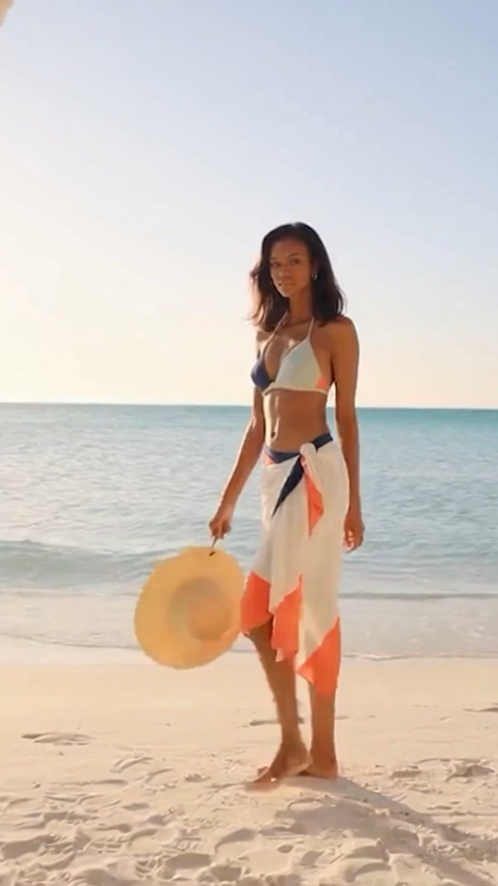
Choose one main garment color, one supporting scene color, and a quiet neutral. Check that the outfit remains distinct from the background in both the opening and final shot. Compare palette variations using the same pose, crop, and lighting.
Give each color a job
A palette becomes easier to manage when each color has a role. The garment color carries the fashion idea. The background supports it. A neutral such as cream, charcoal, or sand gives the other two room to stand out. You do not need to fill every part of the frame with a different saturated color.
Start with three written choices before generating: navy swimwear, warm sand, and a cream cabana, for example. If the result feels too quiet, adjust one accent. If it feels crowded, remove a competing color from the setting. This is a practical editing method, not a rule that every image must contain exactly three colors.
Try three different visual directions
For a calm coastal scene, try navy clothing against sand and cream. For a fresher garden concept, consider an opaque coral swimsuit with muted greenery and a pale stone wall. For a graphic studio look, place dark swimwear against a light neutral backdrop with one restrained accent prop.
These are creative starting points rather than promises about mood or audience response. A color that feels lively to one viewer can feel distracting to another. Judge the actual frame and the garment details instead of relying on a universal meaning for a hue.
Separate the subject from the scene
An outfit can disappear into a background with a similar tone even when the colors have different names. Look at the edges of the garment at thumbnail size. If they are difficult to follow, lighten the background, darken the garment, or simplify the scenery rather than adding more accessories.
Patterns need extra care. A small repeating print may become visually noisy once the video is reduced for a card or phone screen. Begin with a solid color or broad pattern, then check a smaller preview before committing. Our square framing checklist helps keep the clothing legible inside a compact composition.
Keep the comparison fair
When testing two palettes, use the same fictional adult model description, camera position, lighting, and backdrop layout. Change the garment color first. If you also change the pose and location, you will not know whether the palette or the new composition improved the result.
The older Logomakerr article on choosing a color palette provides another way to organize a limited set of colors. For fashion videos, translate that idea into a simple scene brief and judge the complete moving image, not isolated swatches.
Check the transition and final frame
Watch for unintended color changes during the clip. A swimsuit that drifts from blue to purple or a wall that becomes much warmer after the cut can weaken continuity. Review the opening, the first clear frame after the transition, and the final hold side by side.
Finish with a short note describing the selected palette and why it works in that setting. Pair it with the five-second storyboard guide to turn the color study into one clear outfit transition. The current studio offers pre-rendered examples; custom generation is limited to a private owner preview, and checkout remains unavailable.
People also ask
Frequently asked questions
How many colors should I start with?
Start with a main garment color, a supporting scene color, and a neutral, then adjust the actual frame.
Is black always the best swimwear color?
No. It can offer strong separation on a pale background but may lose detail in a dark scene.
Should every clip use the same palette?
A consistent palette can tie a series together, but change it when the concept calls for a different visual direction.